Updated Corner Design
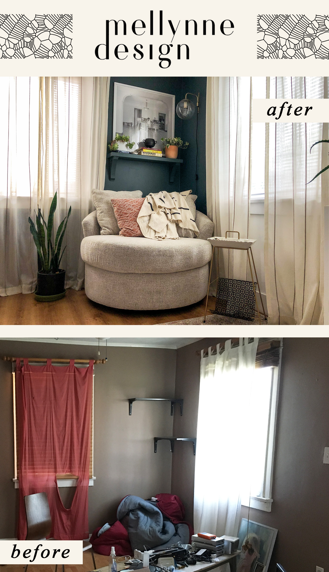
A refresh can be as simple as updating a corner and repainting. The tenants who previously occupied this space weren’t using the corner wisely, so we started over.
3 goals: make it cozy, interesting and add a lighting element.
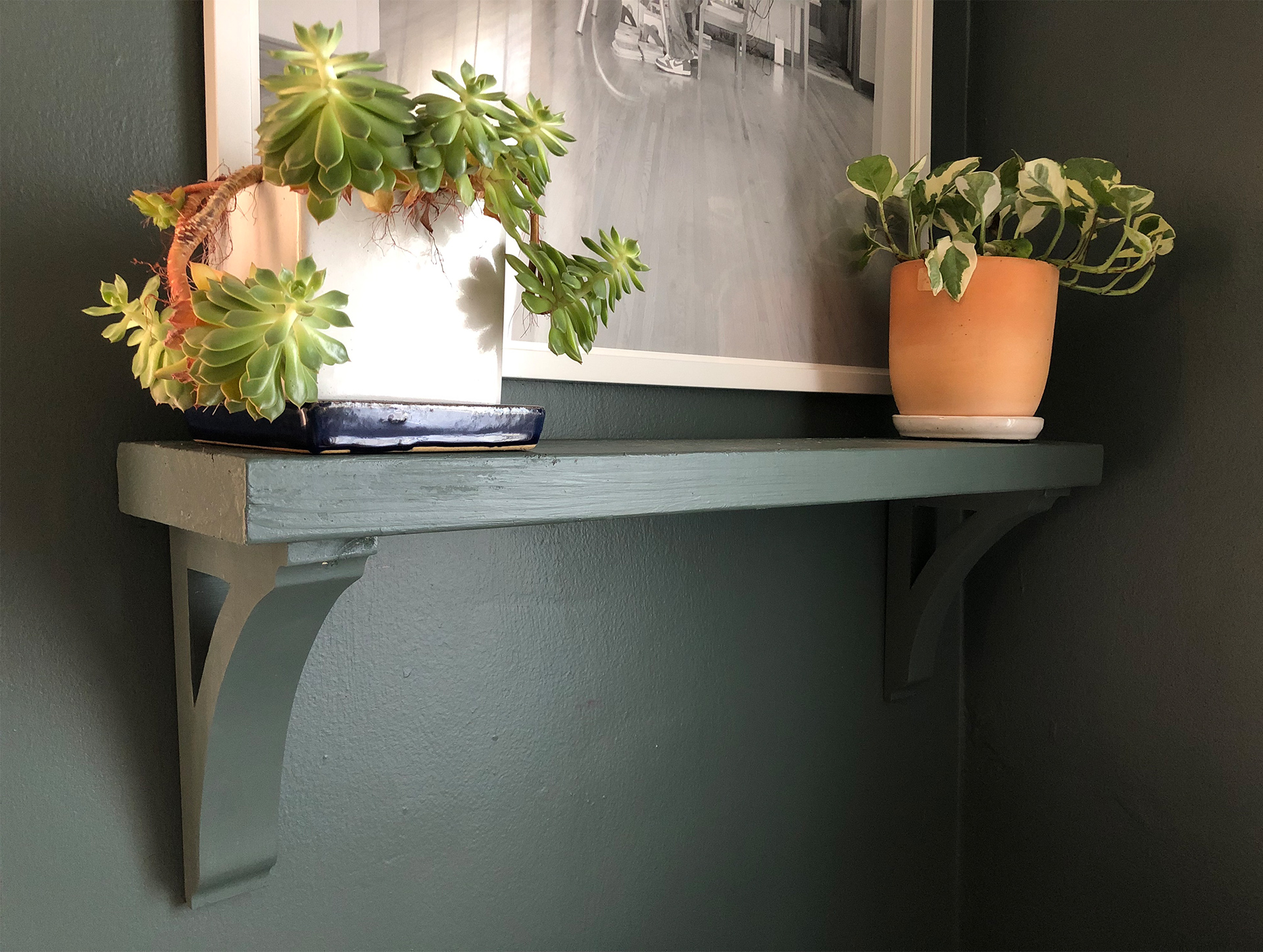
Built-ins were requested, but since it’s such a small space, they weren’t going to work. To get that built-in look without eating up floor space, we camouflaged a shelf. The all-in-one painted look draws the eye to the items on the shelf and helps keep the focus on the contrasting art work above.
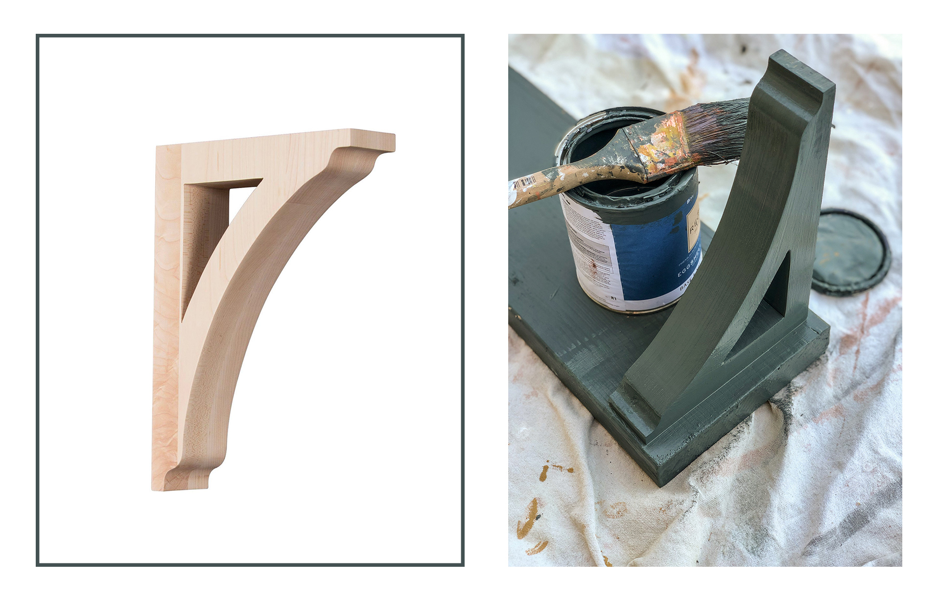
We originally thought the color was too dark, but after the light filtering drapes were installed and the furniture was set, it completely brightened the corner up. We used Dark Pewter x Benjamin Moore with a Satin finish.
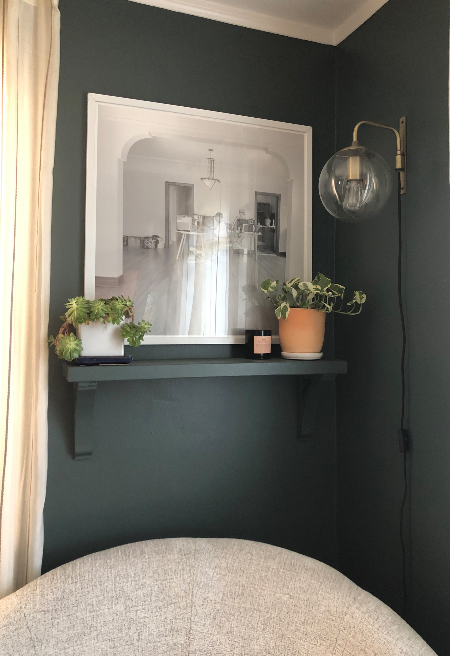
A trick to making a small space look larger, use the walls! Instead of a floor lamp, we went with a globe wall sconce that floats. Re-wiring the corner for a sconce wasn’t an option, so we had to go with a plug-in sconce that shows the cord.
Typically i’m not a fan of plug in wall sconces with cords showing, but since the cord is black and the walls are dark it works. Lighting options are everything and immediately make the room cozy!
Note: Excuse the grainy iPhone photos!


